Covid-19 Data Visualisation in Python

Introduction
The pandemic has impacted the global economy and people’s livelihoods. How is coronavirus affecting the nations and people? What countries are worst-affected by Covid-19? This project presented data analysis in python, turning Covid-19 into a data visualisation.
Starting at the end of 2019, some websites such as John Hopkins University, began collecting data from all around the world. To make this project simple to tackle, I decided to work with the Coronavirus Covid19 API published by postman.com, which consists of the summary of cumulative confirmed cases in each country updates daily.
This project uses python libraries such as Json, Pandas and Matplotlib to clean, analyse and visualise dataset. In the end of project, two data visualisation will be presented:
- Case 1: Top 10 countries with most confirmed cases.
- Case 2: Mapping the death rate of the worst-affected country.
Case 1: Top 10 countries with most confirmed cases
1. Importing Data
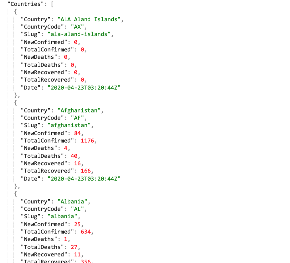
Firstly, accessing the Covid-19 JSON format downloaded by date of April 2020 from Coronavirus APIs. A quick investigation reveals that the JSON file is structured within ‘ID’, ‘Message’, ‘Global’, ‘Countries’ and ‘Date’ objects. ‘Countries’ which consists of total confirmed cases is what we need, so we filtered out the specific attributes and values.
(Note: install JSONView chrome extension to get easy-to-read json tree with chrome browser)
import json
import pandas as pd
import matplotlib.pyplot as plt

with open('covid19_summary_200423.json', 'r') as read_file:
    data = json.load(read_file)

country_data = data['Countries']
2. Cleaning Data
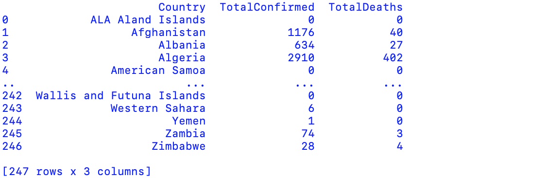
pandas.DataFrame converts the number of rows and columns to DataFrame. Using loc to select data columns by labels: ‘Country’, ‘TotalConfirmed’ and ‘Total Deaths’. The following table displays 192 countries with confirmed/death numbers in alphabetical order; therefore, our next step is to reorder the list by the numbers of confirmed cases.
df = pd.DataFrame(country_data)
df = df.loc[:, ['Country', 'TotalConfirmed', 'TotalDeaths']]
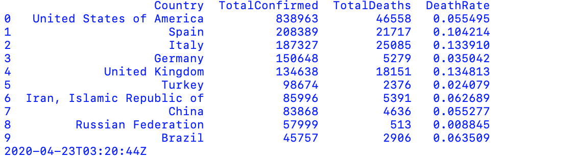
We use sort_values fo sort dataframe by a specific column’s value, ranking the confirmed case from most to least numbers. The pandas loc method allow us to take only index labels and returns the first 10 highly affected nations.
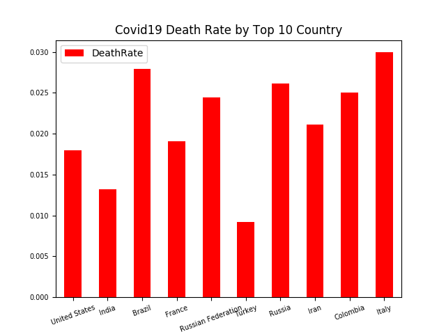
For additional information, we also apply eval method to calculate the death rate.
df = df.sort_values(by='TotalConfirmed', ascending = False)
df.index = range(len(df))
df = df.loc[0:9]
df.eval('DeathRate = TotalDeaths/TotalConfirmed', inplace = True)
date = data['Date']

print(df)
print(date)
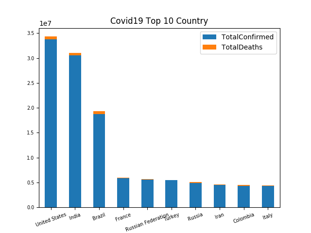
3. Visualising Data
Using matplotlib.pyplot to visualise data into bar chart. The df1 object demonstrates the top 10 countries with most confirmed cases whilst df2 displays the death rate as reference.
import matplotlib.pyplot as plt

df.loc[0, 'Country'] = 'United States'
df.loc[6, 'Country'] = 'Russia'
df.loc[7, 'Country'] = 'Iran'

df1 = df.loc[:, ['Country', 'TotalConfirmed', 'TotalDeaths']]
df1 = df1.set_index('Country')
df1.plot.bar(stacked = True)

plt.xticks(rotation=20)
plt.tick_params(labelsize = 7)

plt.title('Covid19 Top 10 Country')
plt.savefig('Covid19_top10_country.png')
df2 = df.loc[:, ['Country', 'DeathRate']]
df2 = df2.set_index('Country')
df2.plot.bar(color = 'r')

plt.xticks(rotation=20)
plt.tick_params(labelsize = 7)

plt.title('Covid19 Death Rate by Top 10 Country')
plt.savefig('Covid19_death_rate_by_top10_country.png')

plt.show()
Case 2: Mapping the death rate of the worst-affected country
The result above reveals United States is the worst-affected country, accounting for 838,963 total confirmed cases by the date of April 23.
1. Importing Data
We download data by country and status: ‘Covid19_US_confirmed.json’, ‘Covid19_US_Deaths.json’ and ‘Covid19_US_Recovered.json, which recorded data from January to May 2020.
A pre-created template allows us to convert data into dataframe more efficiently.
import pandas as pd
import matplotlib.pyplot as plt
import bokeh

template = 'Covid19_US_{}.json'
statuses = ['Confirmed','Deaths','Recovered']
dfs = dict()

for status in statuses:
    df = pd.read_json(template.format(status))
    dfs[status] = df
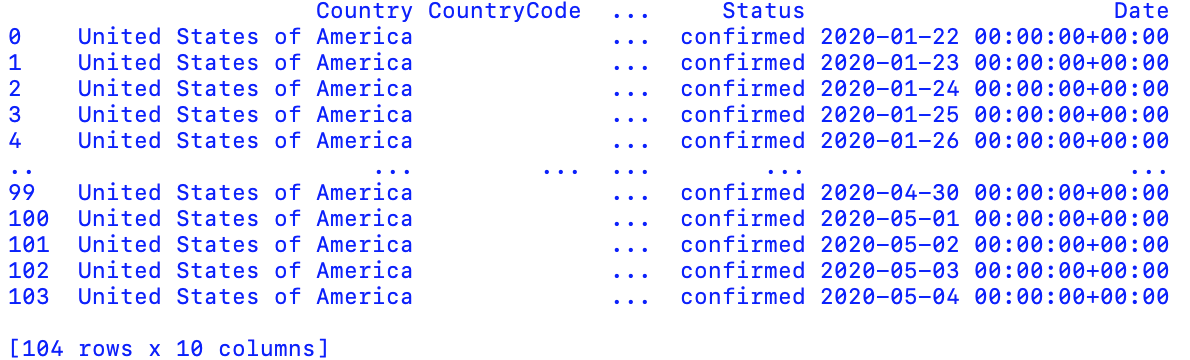
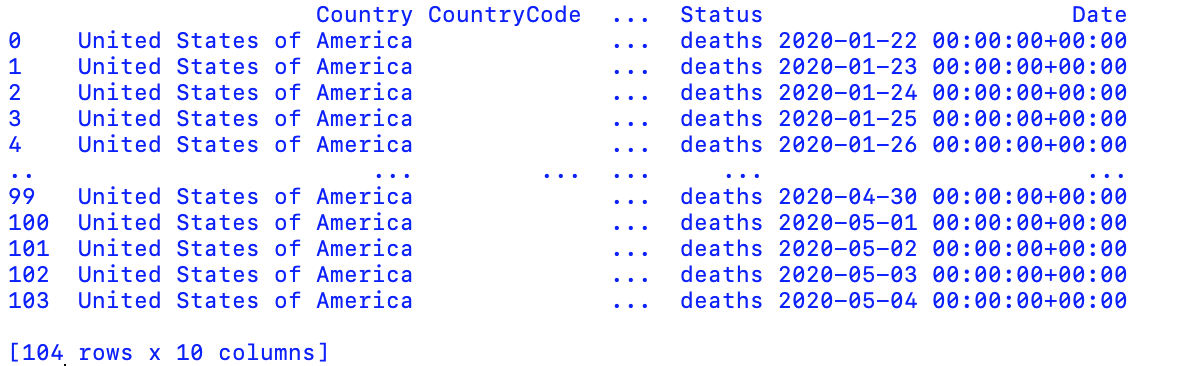
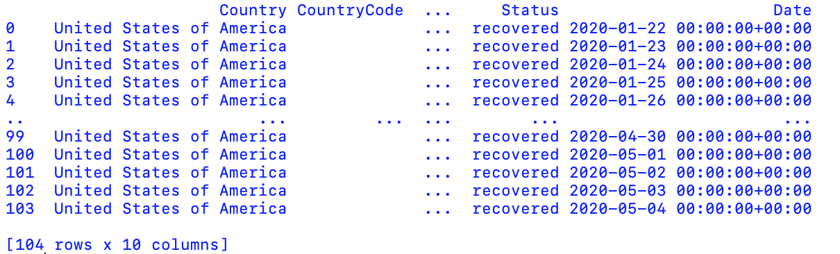
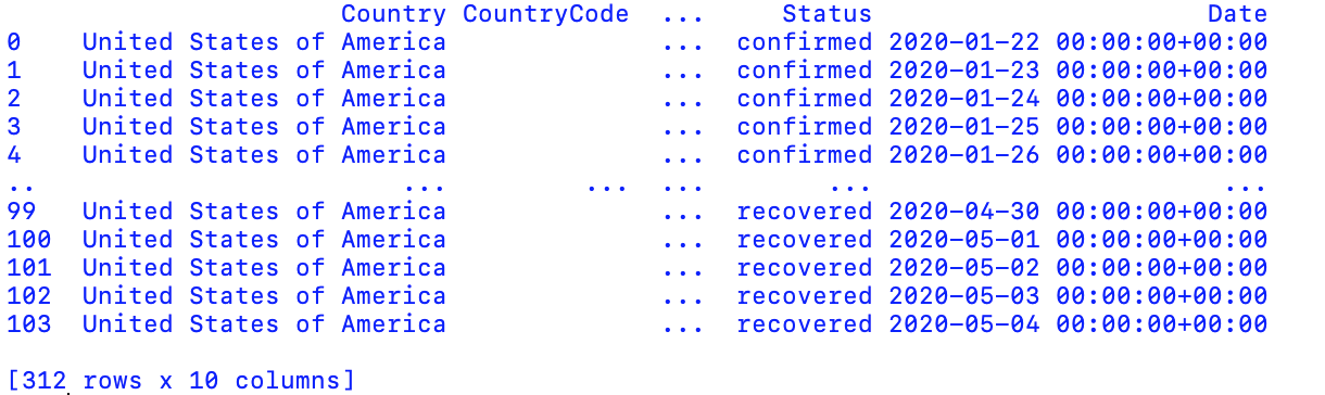
Next, integrate three dataframe into one table by concat method. The following picture shows a table with 312 rows after concatenation.
dfall = pd.concat(dfs.values())
2. Cleaning Data
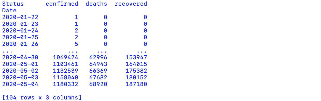
Before moving forward, we use dt.date method to delete unneeded time data.
Data is often stored in stacked format, listing every single observation. Our final step before visualisation is to reshape stacked (long) format into unstacked (wide) format by using pivot whilst setting up ‘Date’ and ‘Status’ as index.
dfall['Date'] = dfall['Date'].dt.date
dfall = dfall.pivot('Date', 'Status', 'Cases')
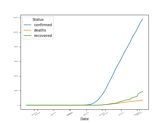
3. Visualising Data
A run chart helps us to study data for pattern over a specific period of time. Using plot to draw a trend line, we‘re seeing a upward trend that confirmed cases in United States is increasing by a large amount.
dfall.plot()
plt.xticks(rotation=30)
plt.tick_params(labelsize = 3)
plt.savefig('Covid19_US_trend.png')
plt.show()